Mobile
While Userflow does not support native mobile apps (e.g. native iOS or Android), it does support mobile web apps.
All the Userflow content itself is fully responsive, but in certain scenarios you still need to handle mobile content more actively e.g.
- If you want a resource/checklist launcher to be smaller on mobile, or
- if you have a different UI/CSS for your desktop version vs. your mobile version.
Recognize if user is on mobile
To be able to cater content specifically for mobile, you first of all need to have Userflow.js pass an attribute called device_type, which can e.g. be configured like below:
userflow.identify(userId, {
  //...
  device_type: window.innerWidth > 800 ? 'desktop' : 'mobile'
})
This user attribute will show as mobile if the user is on mobile, and desktop if not. You can use this attribute in different conditions, two examples are explained below.
Smaller resource center/checklist launchers for mobile
Even though the Userflow content is responsive, the resource center/checklist launchers might still seem to big. In case you want to make them smaller for mobile, you don’t have to create new checklists/resource centers on a separate theme. Instead you can use Userflows powerful conditional theme variations.
-
Step 1: Go to themes, and select your main theme.
-
Step 2: Add a conditional variation using the device type user attribute.
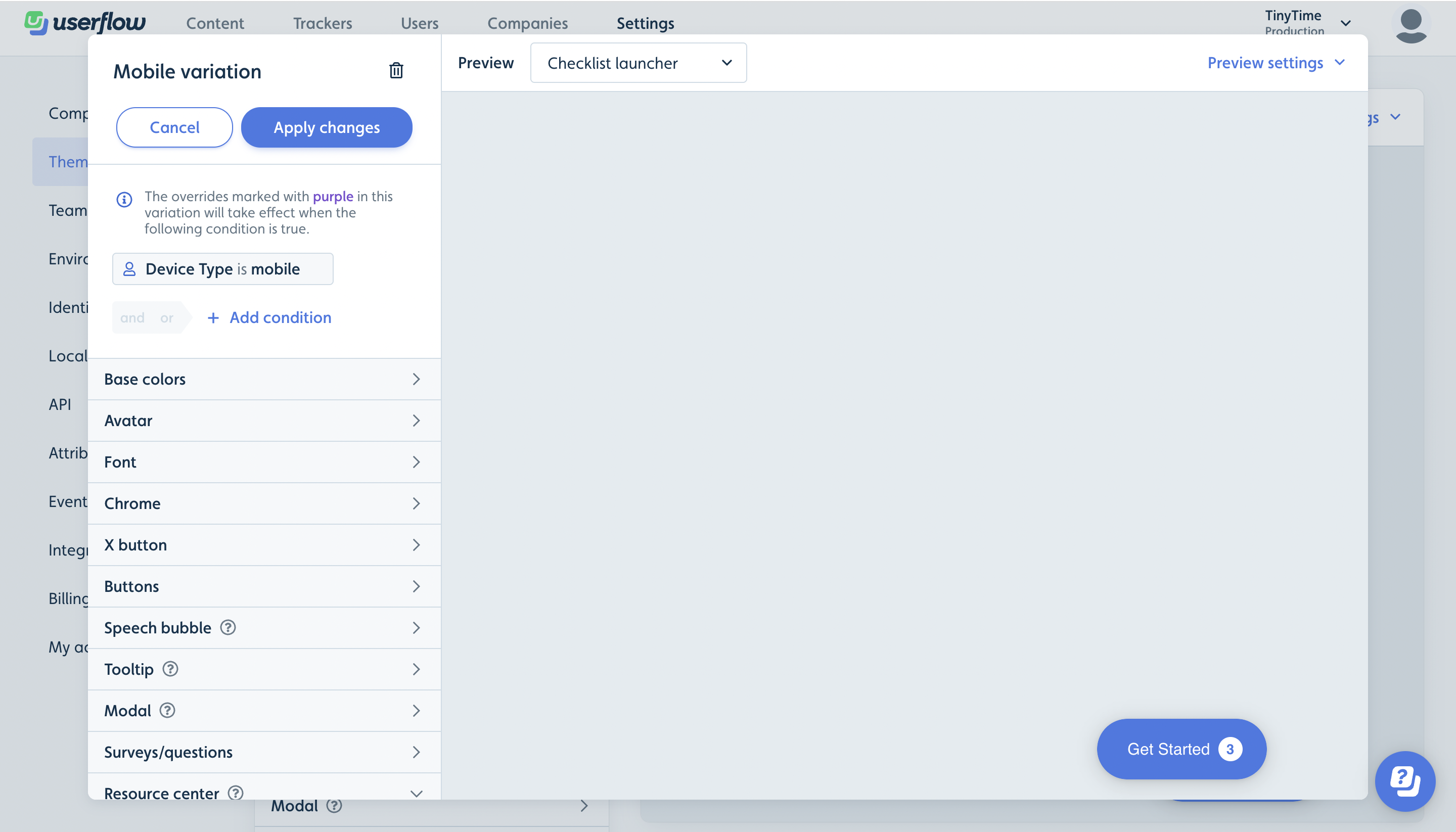
- Step 3: Change the size of checklist/resource center in the variation and save the theme. Now Userflow will automatically apply this variation when the user atribute device type is mobile.
Separate flows based on device type
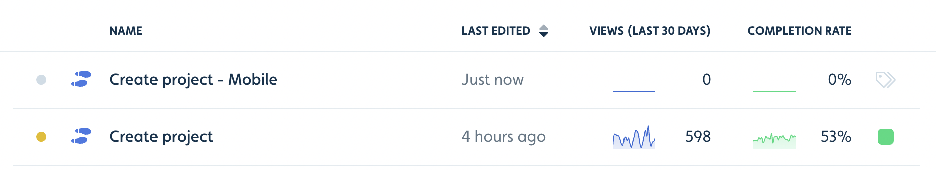
If your UI is significantly different between desktop and mobile you can create two separate flows/checklists for desktop vs. mobile and adjust the steps in each flow/checklist to the given UI. See steps below.
- Step 1: Create two separate flows/checklists, one for mobile and one for desktop
- Step 2: Set each flow/checklist to only start when on the given device type using the user attribute and to be hidden when not on this device type.
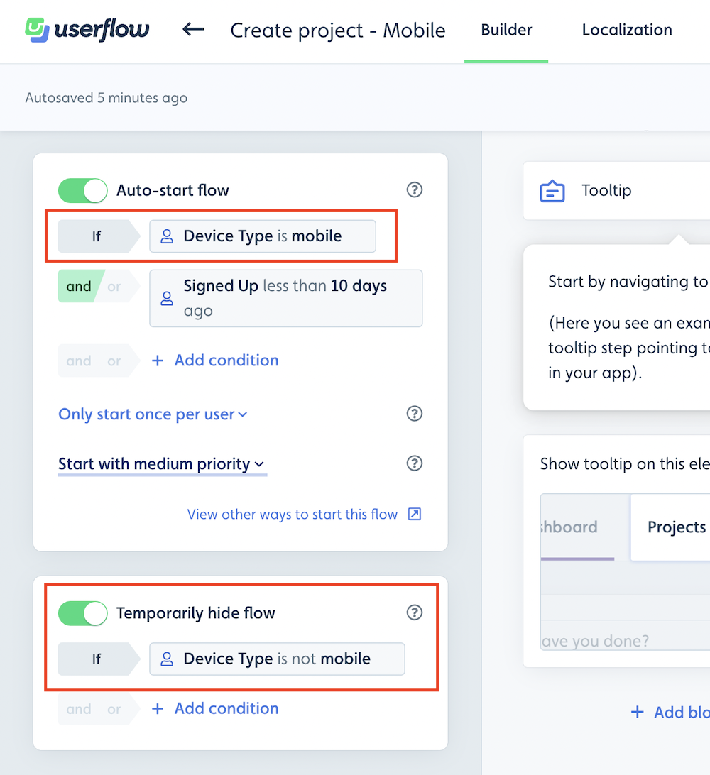
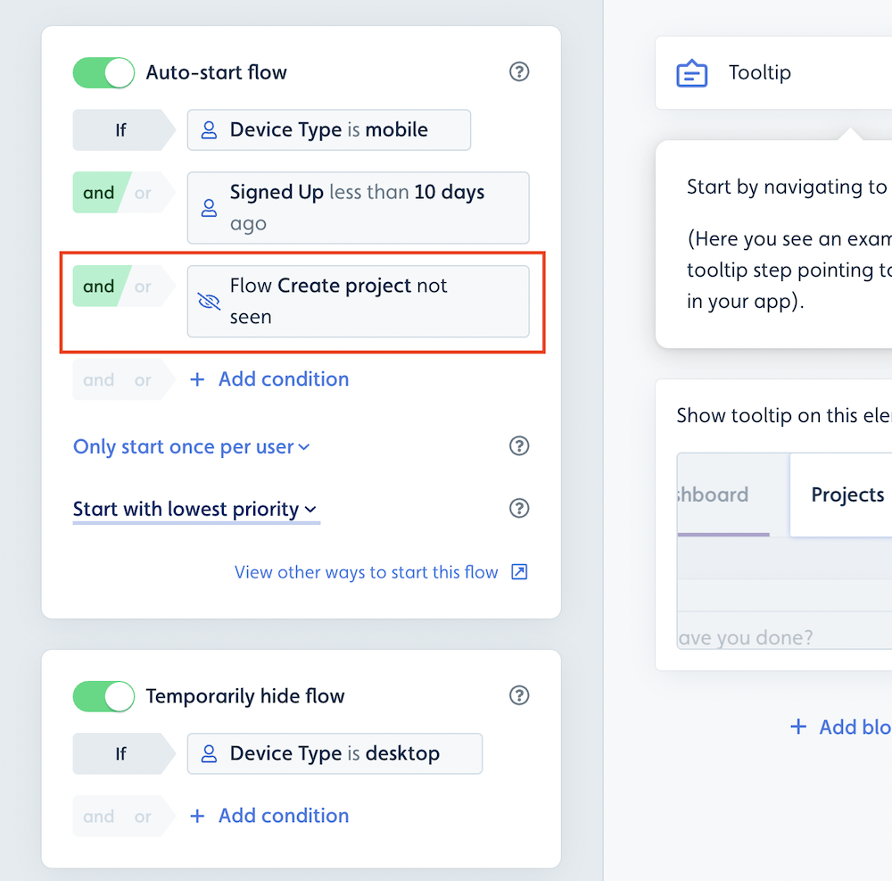
- Step 3: To avoid the duplicate flow starting twice (once for mobile and once for desktop) you can furthermore add a condition to only start the duplicate flow in case the other flow have not been seen.
Disabling Userflow completely on mobile
If you want to completely disable Userflow on mobile, you would have remove the Userflow.js snippet from mobile view. Then the users won’t be registered and no content will be served.