Themes
With themes, you can make flows and other Userflow content look like a native part of your app. We use a powerful, yet easy-to-use, WYSIWYG (What You See Is What You Get) no-code editor to customize all aspects of your theme. You won’t need any CSS or coding skills.
Table of contents
- Creating a theme
- Designing your first theme
- Conditional variations
- Setting a default theme
- Applying themes to content
- Theme settings
- Custom CSS and buttons
Creating a theme
To modify or create a new theme go to Settings → Themes.
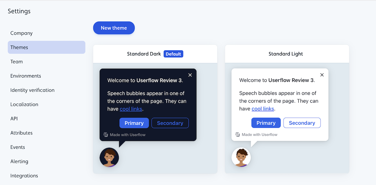
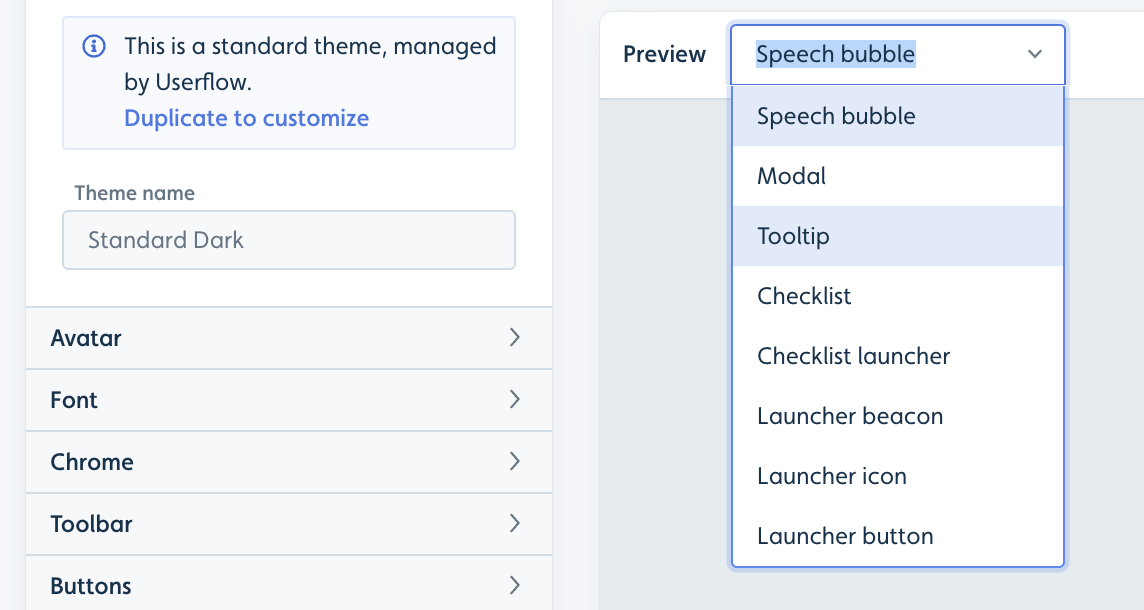
From here you can either click New theme or click on an existing standard theme.
To edit an existing standard theme you will need to select it and click Duplicate to customize.
Designing your first theme
We recommend starting out by adjusting the following options:
- Under Base colors, pick your Brand Background color and Main Text color. All other elements and hover/active states will automatically match.
- Under Avatar, upload a photo of one of your team members or your company logo/icon.
- Under Font, pick your app’s font. We support all standard and Google fonts out-of-the-box. For other fonts, please reach out to us.
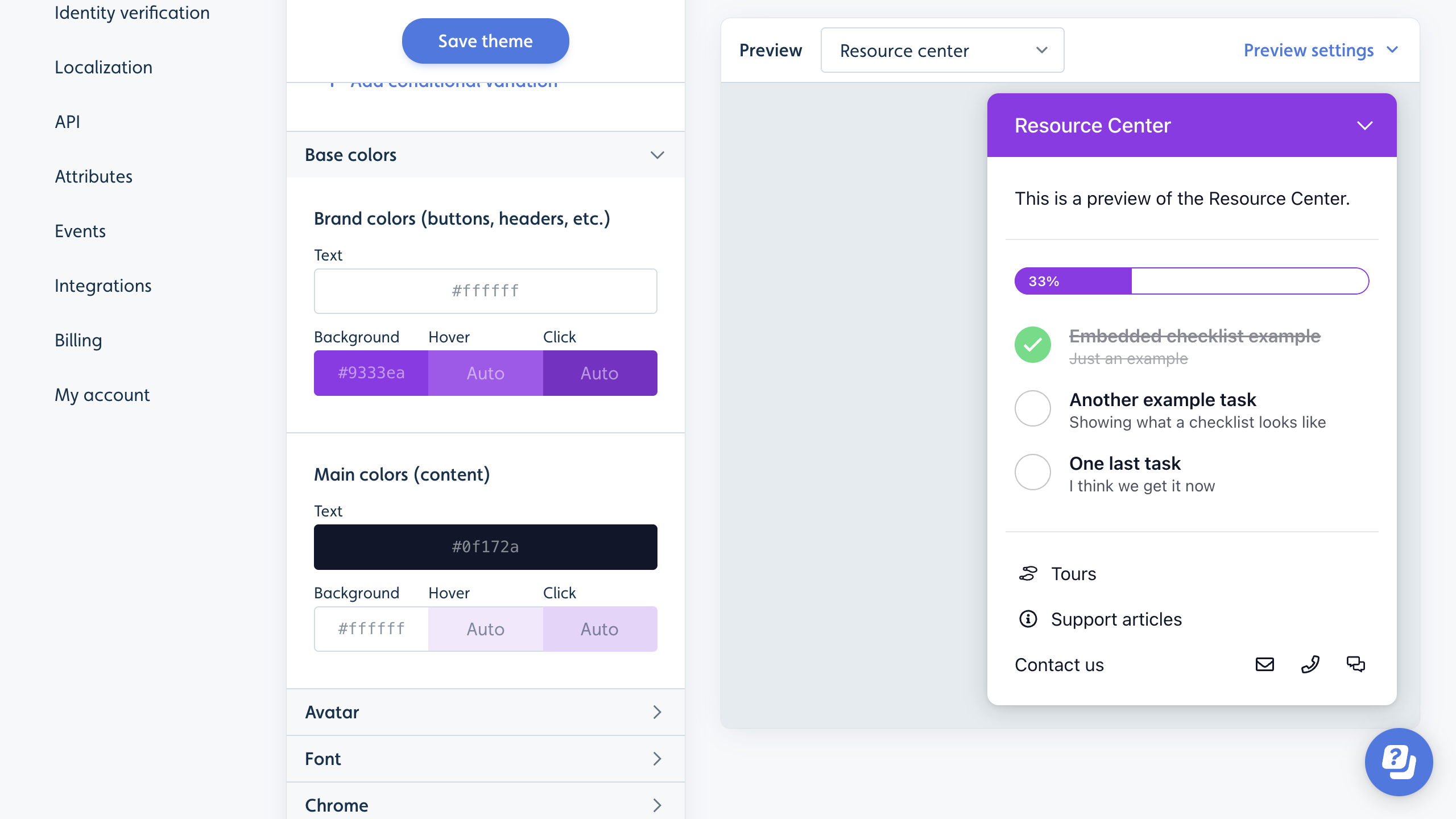
In the Preview area, you can see a live example of what your theme looks like.
Other examples of what you can modify:
- Font sizes
- Button size, position, and colors
- Tooltip size, position, and colors
- Checklist size, position, and colors
You can change the preview content using this dropdown menu if you e.g. want to see what your theme looks like for tooltips, modals, etc.
Conditional variations
You can create conditional overrides of your theme based on user (and company) attributes and URLs (via current page conditions). Example use cases:
- Support both dark and light mode in a single theme. This requires your Userflow.js snippet to pass a user attribute indicating whether the user is in dark or light mode.
- Adjust sizing on mobile.
- Adjust avatar or other personalization based on user attributes (e.g. match users with an avatar of their customer success manager).
- Change the color of the content based on a company/user attribute or the URL the user is on. E.g. to handle white labeled versions of your software with a different color scheme.
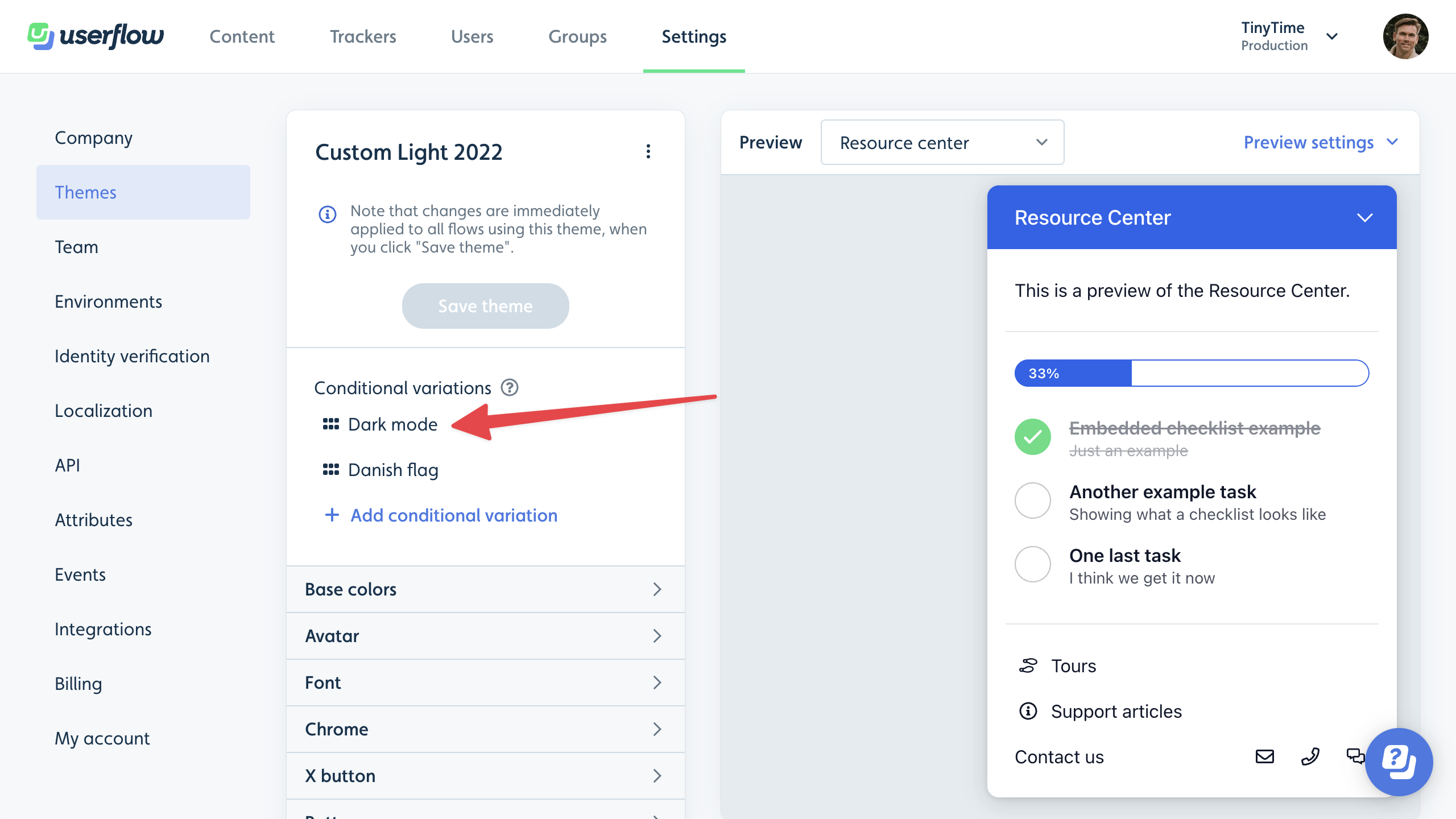
Notice the “Dark Mode” condition and the overridden theme properties marked with purple text:
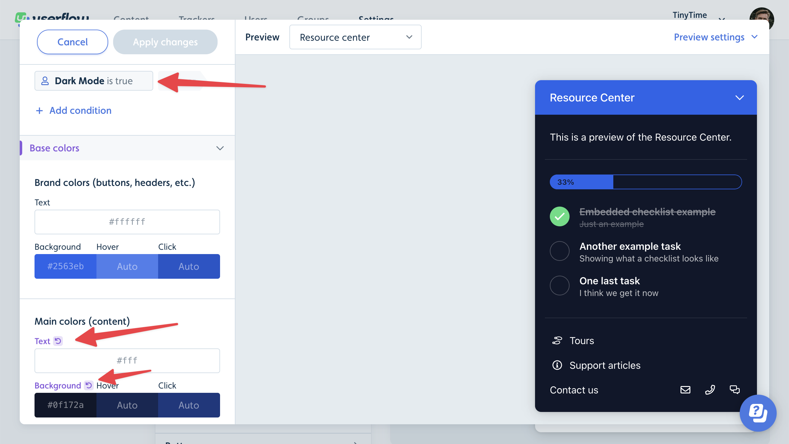
All overrides from all variations with true conditions, will be applied to the main theme, in the order they’re listed.
Setting a default theme
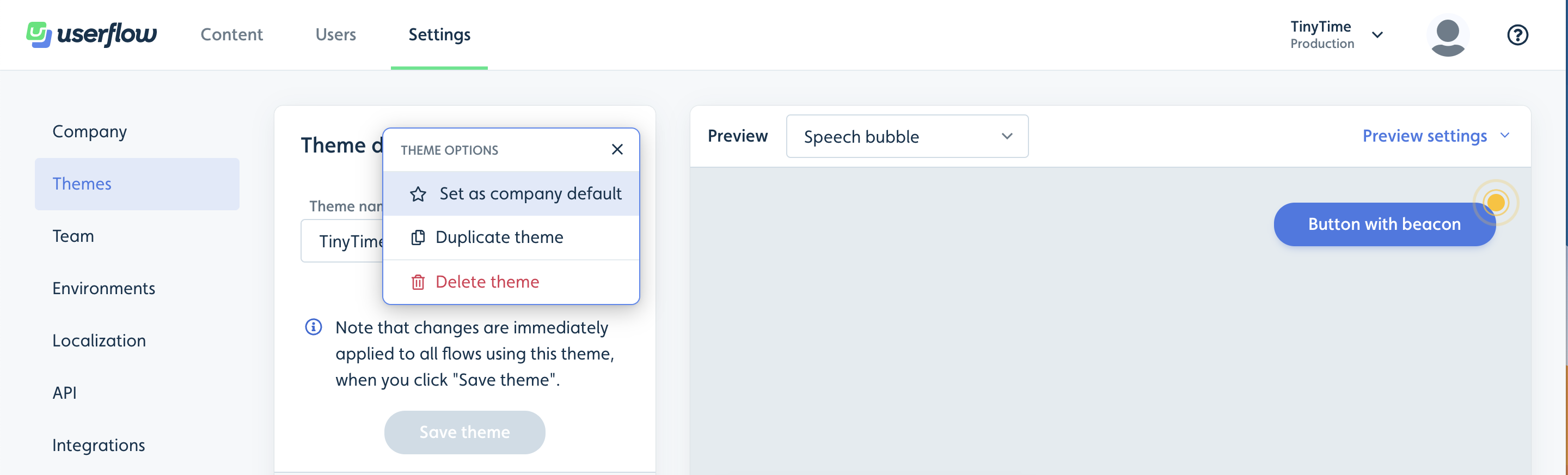
You can make the new theme your default theme, which means it will be used by default on all new content. You can change theme on specific flows, checklists, and launchers. You can promote a theme to be the default theme by clicking on the 3 dot menu next to the theme title.
Applying themes to content
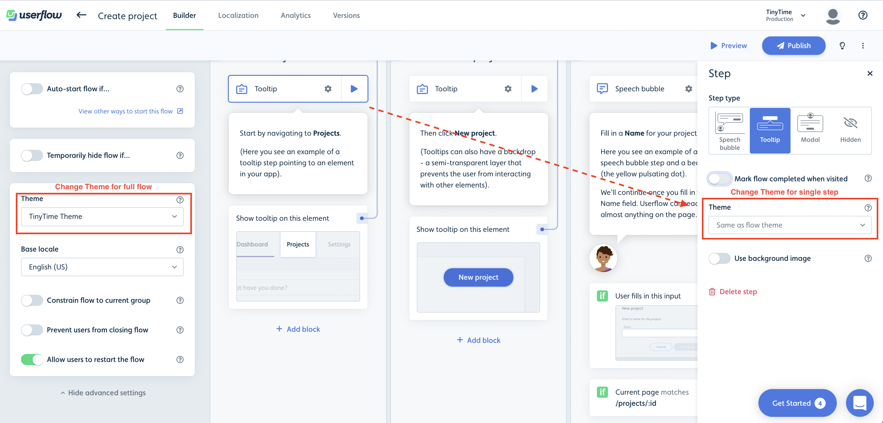
You can change the theme for flows/checklists/launchers via the Show advanced settings button in the builder.
You can also change the theme for a specific flow step by clicking on its gear icon, and then picking another theme in the right side panel.
Theme Settings
With a theme you can customize the look and feel of your Userflow content by changing things like colors, font, size/dimensions of content, position of content and launchers, and much more. All without any form of code. Below is a list of the various theme settings and how you can use them:
- Base colors: You can use the base color theme settings to change the colors of headers, buttons, background and text for all content (speech bubbles, tooltips, modals, launchers, etc.). Note that the base colors can be overwritten on the more focused theme settings as well.
- Font: You can use the font theme settings to change the font color, font family, font size, font height and font weight.
- Chrome border radius: You can use the chrome border radius theme setting to change the border radius of modals, tooltips and speech bubbles.
- X-button: You can use the X-button theme settings to change the color of the X-button for flows/checklists and to change the X-button behavior i.e. whether it should show an exit menu with the options to resume, close or restart, or if it should just dismiss the flow.
- Avatar type: You can use the avatar type theme setting to change the avatar on modals and speech bubbles to be a cartoon character, custom image upload/url, or to not use an avatar at all.
- Buttons: You can use the button theme settings to change the height, width, border radius, color (base, on click, and on hover) and alignment (left, right, center) of buttons inside modals, tooltips and speech bubbles. One can have different settings for primary and secondary buttons respectively.
- Speech bubble: You can use the speech bubble theme settings to change the width and position of the speech bubbles in a flow. You can position the speech bubble to be in the bottom left, bottom right, bottom center, top left, top right, or top center. You can also adjust the offset.
- Tooltip: You can use the tooltip theme settings to adjust the width and notch size for the tooltips in a flow/launcher. As well as the Missing tooltip target tolerance (time to wait before missing tooltip target behavior) and the Missing tooltip target behavior (whether to auto-dismiss, show warning or use speech bubble).
- Modal: You can use the modal theme settings to change the width and padding of modals in flows. Modals by default have a backdrop, and with these theme settings you can also adjust the modal backdrop behavior to either block clicks or dismiss the flow.
- Resource center: You can use the resource center theme settings to change the width, z-index and position of the resource center. You can position the resource center in the bottom left, bottom right, top left, or top right. You can also toggle whether you want to use manually inserted divider lines instead of the default auto-inserted ones. Finally note that Resource center colors can be changed via the base color theme settings.
- Resource center launcher: You can use the resource center launcher theme settings to change the width, z-index and position of the resource center launcher. You can position the resource center launcher in the bottom left, bottom right, top left, or top right. You can also change which title text you want to show on the launcher i.e the active checklist title (if you use the checklist block), the resource center title, or nothing. Additionally you can change the resource center launcher icon to either be the Userflow branded question mark or a plain question mark. Note that Resource center launcher colors can be changed via the base color theme settings.
- Checklist: You can use the checklist theme settings to change the colors, width, z-index and position of the checklist. You can position the checklist in the bottom left, bottom right, bottom center, top left, top right, or top center. You can also change the completed task decoration to either have a line-through or nothing.
- Checklist launcher: You can use the checklist launcher theme settings to change the colors (base, on click, and on hover), width, z-index and position of the checklist launcher. You can position the checklist launcher in the bottom left, bottom right, bottom center, top left, top right, or top center. Note that if you are using the resource center to show the active checklist, then these settings are overuled by the resource center launcher theme settings.
- Progress bar: The progress bar is shown on flows as they progress on each step. You can use the progress bar theme settings to change the progress bar color and height.
- Beacons: You can use the beacon theme settings to change the beacon color for flows and launchers.
- Launcher icons: You can use the launcher icon theme settings to change the icon size, colors and opacity for launcher icons.
- Launcher buttons: You can use the launcher button theme settings to change the colors (base, on click, and on hover), height, width, border radius and border size for launcher buttons.
- Backdrop: Backdrop is what is shown to block clicks and to better highlight either a modal or a tooltip target. You can use the backdrop theme settings to change the backdrop color, opacity, highlight type, highlight radius, highlight spread, highlight color and highlight opacity.
- Focus highlight: The focus highlight is shown on buttons for accessibility reasons. You can use the focus highlight theme settings to change the color and opacity of the focus highlight.
- Voice-over:: You can use the voice-over theme settings to change the voice type for voice-over to either be synthetic, manual, or not have voice-over at all.
- Interaction with other chat providers: You can use this theme setting to hide chat providers while a speech bubble is active (e.g. intercom, hubspot, crisp). This is great in cases where a speech bubble overlaps with the chat provider.
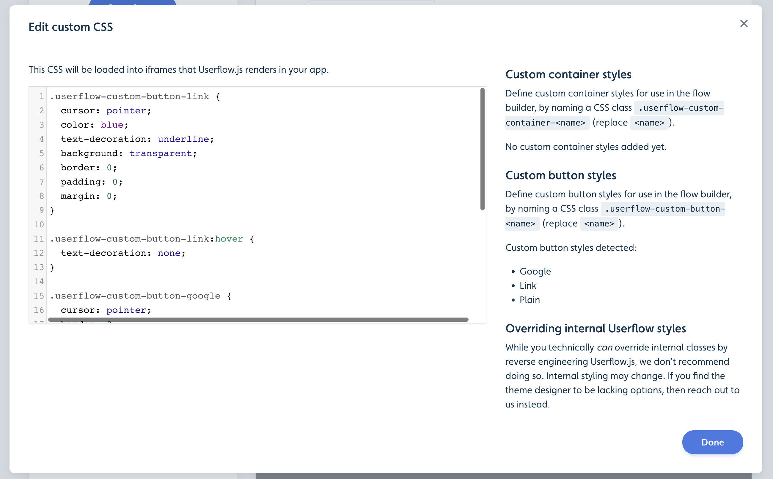
Custom CSS and buttons
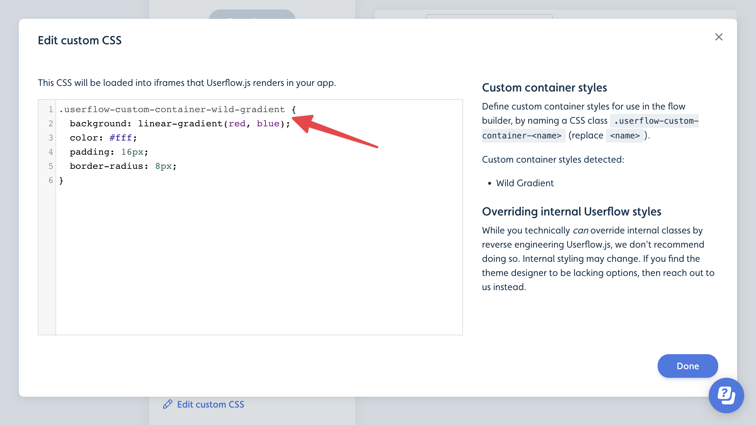
As a last resort in cases where you cannot customize the look and feel using the advanced standard theme options, we do offer a custom css option.
One can insert containers in Userflow content (+ -> Container) and with custom css you can add your own custom container styles powered by CSS. In the theme designer, look for the Custom CSS section. Here you can write CSS such as this:
You can also create your own custom button styles. In the screenshot below, we have added a custom “Link” button and a custom “Sign in with Google”-style button.
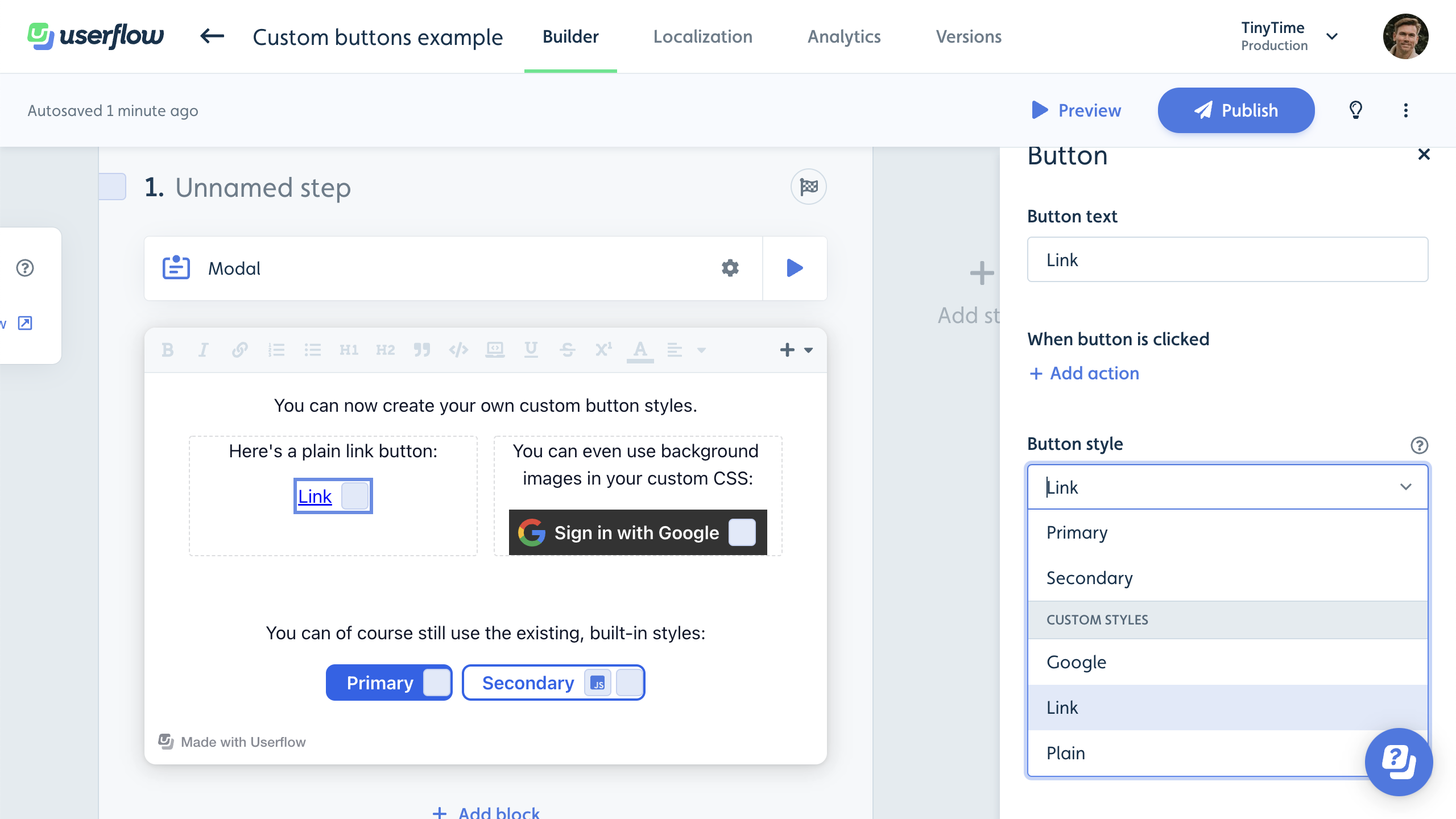
Simply add a .userflow-custom-button-<name> class in your theme’s custom CSS. The style will show up in the button’s side panel in the builder.